Typography's Greatest Drama: The Doves Press Feud and Its Legacy
The Doves Press was a private press renowned for its exquisite craftsmanship. It produced some of the most beautiful books of its time using its unique typeface, the Doves Type. The partnership between its founders, T.J. Cobden-Sanderson and Emery Walker, once united by their shared vision, ultimately unravelled into a bitter feud that culminated in one of the most dramatic acts in typographic history: the deliberate destruction of the Doves Type. For nearly a century, this legendary typeface was thought to be lost forever, buried in the depths of the River Thames—until a remarkable rediscovery in the 21st century brought it back to light. This blog post delves into the fascinating tale of the Doves Press, the clash of egos that led to its downfall, and the extraordinary efforts to recover a lost piece of design history. Let's go!

The English Bible, on velum, 1903-1905, via Forum Auctions
What Makes the Craftsmanship of the Doves Press Unique?
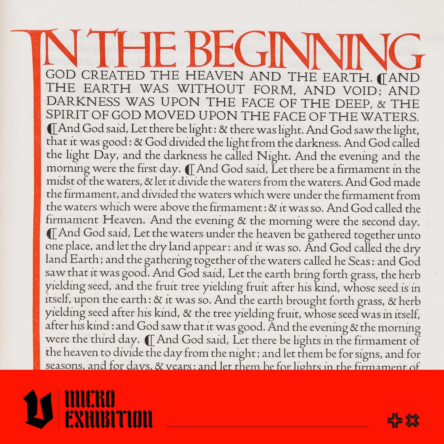
The Doves Press was a private press based in London, England. A private press differs from a commercial book press because it aims to celebrate the artisanal process of book-making. Books made by private presses may feature unique typefaces, elaborate covers and high-quality inks and paper.
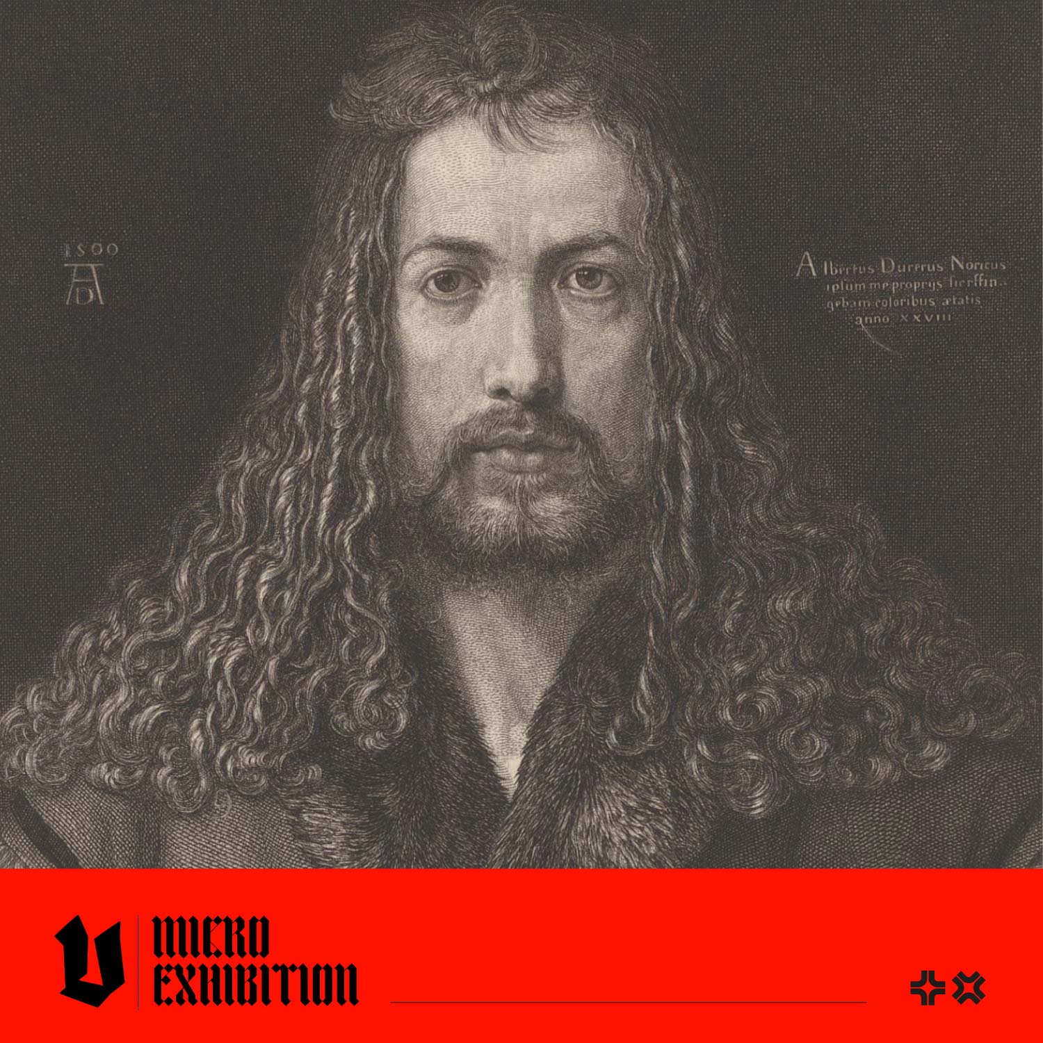
Doves Press was founded in 1900 by bookbinder T.J Cobden-Sanderson, who invited engraver, printer and photographer Emery Walker to join the venture. The books were beautifully made with their own typeface, designed by the founders and other artisans. The book's headings and capital letters were inked in striking red ink, sometimes by a calligrapher's own hand. The press published a series of well-known titles, including The Bible in five volumes, Paradise Lost and Paradise Regained, by John Milton, and works by Goethe, Shakespeare and Keats. The classic Doves Press aesthetic influenced book design in Europe and the United States.

Catalogue Raisonné of Books Printed & Published at the Doves Press, 1900-1916. Hammersmith, 1916. via Christie's
What is the Mysterious and Dramatic Tale of The Doves Type?
The partnership between Cobden-Sanderson and Walker began to deteriorate in 1902. Cobden-Sanderson wanted Walker to work alongside him, but Walker's other businesses and commitments took up much of his time, causing friction between the men.
In 1906, they agreed to dissolve the partnership after publishing the final volume of their Bible series. Initially, the partners had decided that when the business closed, Walker would be entitled to a set of the metal type to use. Still, when the time came, Cobden-Sanderson felt a lot of ownership of the business; unlike Walker, he'd devoted a lot of time to it. The Dove's Press was originally his idea, and his wife, Annie, had financed the project. The type was never made commercially available, and the idea that it could be used to create inferior, Dove's Press-inspired books, potentially on a mechanised press, and without his involvement was abhorrent to Cobden-Sanderson. Eventually, the men reached a compromise; Walker would inherit the type after the death of Cobden-Sanderson. Or would he?
In a dramatic move, Cobden-Sanderson decided to destroy the type rather than let it fall into Walker's hands. Between 1913 and 1917, Cobden-Sanderson covertly threw the entire Doves Type—estimated to be around 500,000 pieces of metal type which would weigh over a ton—into the River Thames from Hammersmith Bridge, just a short distance from the Doves Press. He did this in 170 trips, often under the cover of night, to ensure that Walker could never use the type. He continued running the press alone until March 1917, when Cobden-Sanderson announced the closure of the press and stated the type was "dedicated & consecrated" to the River Thames. After his death in 1922, Emery Walker sued his widow for a significant sum for the loss of the type.

The Tragicall Historie of Hamlet Prince of Denmarke by William Shakespeare, The Doves Press June 1909 via Stockholms Auktionsverket
How Can I Use The Doves Type Today?
While studying at art school, graphic designer Robert Green became fascinated by the tale of the lost Doves Type. He has spent many years researching the typeface and has created a digital version of the Doves Type, which is available to license from the Typespec website here.
Green began digitising the typeface in 2010, releasing his first version of The Doves Type in 2013. In 2014, he gained access to a new batch of archival material and began updating the digital version of the typeface. He read Cobden-Sanderson's journals and was inspired to visit the site of Hammersmith Bridge to inspect the area he thought Cobden-Sanderson had thrown the typefaces. His hunch was rewarded with the discovery of three pieces of metal type, the letters v, i and e. Green enlisted the assistance of the Port of London Authority, who sent a team of scuba divers to the site. Under Green's direction, the divers managed to unearth a further 148 pieces of type. Some of these artefacts have been permanently loaned to Emery Walker's House, an Arts & Crafts museum, and are available for public view today.

Recovered Doves type, photo by Sam Armstrong via Typespec
Interested in Learning More?
Well-executed typography combines visual appeal with clear messaging, making it indispensable for creating impactful and memorable art and design work. It is a fundamental element of design that goes far beyond simply arranging text on a page. It plays a crucial role in setting the tone, conveying the message, and enhancing the overall aesthetic of a design. The choice of typeface, size, spacing, and alignment can evoke emotions, establish hierarchy, and guide the viewer's eye through the content. It improves readability and reinforces the brand identity, making it an essential tool for effective communication. Check out our selection of typographic reference books to enrich and enhance your creative references today!