Today we'll attempt to answer the question absolutely nobody has been asking, but everyone should be: 'What can a Renaissance witch hunt teach a modern graphic designer?' This week’s article about printer’s marks was inspired by my research for our upcoming image archive, Witches and Wizards, a comprehensive collection of images, ranging from sinister depictions of the witches' sabbath to fantastical illustrations of famous scenes from folklore, and much more.
 A witch casting spells over a steaming cauldron. Engraving by H.S. Thomassin after Demaretz
During my research, I delved into the famous late medieval text, Malleus Maleficarum (The Hammer of Witches). While it was purportedly intended as a weapon against the supernatural, modern historians like Christopher S. Mackay point out that its true legacy was the popularisation of violence and prejudice. As Mackay explains, the work "played a major role in the savage efforts undertaken to stamp out witchcraft in Western Europe", effectively acting as a "hammer to be used to smash the conspiracy of sorceresses."
Navigating this text led me to the intricate printer’s marks in the books. These fascinating symbols of identity and authenticity were left by printers to signify that they produced this specific edition of the book. Even within a text designed to spread terror, these printers imprinted a legacy of care and craftsmanship, marking their work with personal emblems that stood for quality, truth, knowledge and resilience.
What is a Printer’s Mark?
In the early centuries of printing, a printer’s mark was a seal of authority, a legal safeguard against piracy, and a personal statement of intent. These marks often contained hidden meanings, alchemical symbols, or visual puns that revealed the personality of the craftsman behind the press.
1. The Evolution of 16th Century Logos
Matthias Apiarius was a pioneer who established the first permanent book press in Bern, Switzerland, around 1537. His mark is a classic example of a canting device, a visual pun in which the imagery "speaks" the name of the bearer.

To understand the design deeper, we have to look at the printer's own history. Matthias’ surname, Apiarius, is a Latinised version of his original German name, Biener, which literally means "bee-keeper." In Latin, apiarius is derived from apis (bee). The mark depicts a bear, the heraldic symbol of the city of Bern, raiding a beehive in a tree. This brilliantly tied his personal identity to his new professional home.
In the 1537 version, the design is a straightforward pun, showing the bear climbing the trunk toward the bees. By 1539, the scene had evolved into a complex moral allegory reflecting the Reformation-era focus on scripture and governance. This version features a mallet hanging from the tree, used to strike the trunk to harvest the honey, and a Bible resting on the ground.

The 1539 mark is anchored by a quote from Proverbs 28:15: Ursus insidians et esuriens, princeps super populum pauperem. While the original Latin Vulgate text mentions both a "roaring lion" (leo rugiens) and a "hungry bear" (ursus esuriens), Apiarius’s chosen visual focuses exclusively on the bear to maintain his brand's connection to Bern. The motto translates as: "As a lurking and hungry bear, so is a wicked prince over a poor people."
By combining this warning about earthly power with the image of the bear seeking the "sweetness" of the Word, Apiarius transformed a simple business logo into a profound statement of his mission: providing spiritual nourishment through the press during the heart of the Swiss Reformation.
2. Is this Printer’s Mark a 16th Century Dupe?
 The unicorns and palm tree mark highlight the fierce competition between the great printing hubs of the 16th century. While this specific imagery was a famous trademark of the Venetian Giunta family, the University of Barcelona CRAI database identifies this particular engraving as belonging to Louis Martin, a printer active in Lyon between 1504 and 1540. The monogram L.M. fits his name perfectly, sitting within a shield supported by two unicorns. In Renaissance symbolism, unicorns represented purity and strength, suggesting the "unadulterated" quality of the text provided by the press. The central palm tree was a traditional symbol of resilience, based on the belief that the tree actually grew stronger when heavy weights were placed upon it.
By adopting a design that closely mirrored the famous Venetian "brand," Martin was strategically positioning his Lyon press as a peer to the most prestigious Italian houses. This type of "visual borrowing" was a common tactic in the 1500s to signal high-quality production to potential buyers. The "Orb and Cross" atop the monogram served as a universal mark of legitimacy, marking him as a trusted Christian printer in an era of intense market rivalry and religious upheaval.
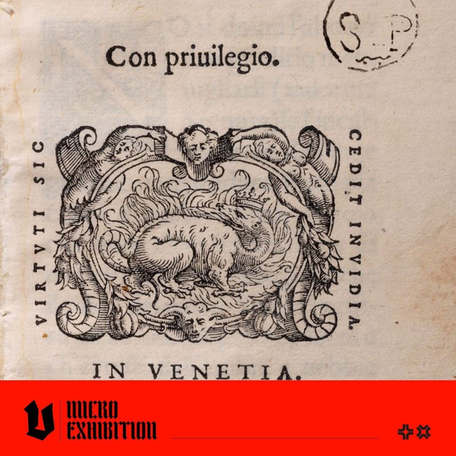
3. The Flaming Salamander: A Logo and Address

Damiano Zenaro was a prominent Venetian publisher active in the late 1500s, known for high quality legal and scholarly volumes. His mark features a crowned salamander surrounded by flames, a creature believed to be fireproof in myth. The motto curving around the frame, Virtuti sic cedit invidia, translates to "Thus envy yields to virtue."
In an era where the "trial by fire" was a literal and terrifying reality, (especailly poigniant when this printer's mark is in the Malleus Malicafarum, a literal manual for killing women accused of witchcraft) Zenaro’s choice of imagery was incredibly bold. While the fires of the stake were intended to erase those they claimed, Zenaro’s salamander suggested a different kind of power: a "virtuous" craftsmanship that could not be burned away. It was a defiant claim that no matter how much his rivals stoked the "heat" of jealousy or professional sabotage, his excellence would emerge from the flames untouched.
Crucially, this mark also served as a literal street address for customers navigating the busy streets of Venice. The text at the bottom, Ad Candentis Salamandrae insigne, translates to "At the sign of the glowing salamander," which was the physical location of his shop. Before standardised addresses, displaying these signs was essential for businesses and ensured that readers who admired the book's quality would know exactly where to buy the next edition.
4. The Stork of Piety, Telling a Story of a Moral Victory
The image of a stork killing a serpent was one of the most recognisable motifs in the Venetian book trade. According to the CRAI records, this specific version belongs to Giovanni Antonio Bertano, active between 1570 and 1612. The mark is defined by the motto Pietas homini tutissima virtus, meaning "Piety is the safest virtue for man."
In Renaissance symbolism, the stork was considered a "pious" bird because of the ancient belief that it cared for its elderly parents, making it a perfect mascot for religious and scholarly publishing. By showing the stork pinning down and killing a writhing serpent (a symbol of vice or evil), Bertano was telling his readers that the knowledge contained within his books would provide them with the moral "safety" and virtue required to overcome the temptations of the world.
5. Mercury: The Messenger of Knowledge
Moving into the 17th century, the style of printer's marks shifted from the rugged woodcuts of the Renaissance to the more decorative Baroque engravings seen in the work of Claude Bourgeat. Active in Lyon from 1642 to 1675, Bourgeat’s mark reflects the city's role as an international trade hub. The central figure is Mercury, the messenger of the gods, beside a globe and identifiable by his winged hat.
The banner above him carries the ambitious motto Docta per orbem scripta fero, which translates to "I carry learned writings throughout the world." This image is technically a "tailpiece," used to mark the end of a volume, as indicated by the Latin header Finis Tomi Primi (End of the First Volume). It represents the printer’s final moment of pride, reminding the reader that they are part of a global network of learning facilitated by the Bourgeat press.

These printer’s marks are the direct ancestors of the modern corporate logo. The modern graphic designer and the Renaissance printer faced the same challenges; they needed to help their brand stand out in a crowded marketplace, solve the problem of communicating a complex philosophy at a single glance, and convey that their product was a trusted authority or, in the case of Louis Martin, an adjacent quality. The next time you see the familiar black and white penguin on the spine of a book, or the glowing apple with a bite mark, remember we are participating in a tradition of visual trust that began centuries ago with of the stork, the bear, and the glowing salamander.
INTERESTED IN LEARNING MORE?