Discover the Origins of the Olympic Rings Design and Compare our Top Five Olympic Logo Designs
The Olympic Games are not only a celebration of athletic excellence but also a showcase of global unity, cultural expression, and design innovation. Over the years, the branding of the Olympics has evolved, reflecting changes in design trends, cultural contexts, and technological advancements. From the iconic interlocking rings to the diverse and dynamic logos that define each Olympic host city, the visual identity of the Olympics tells a compelling story of its own. In this post, we'll delve into the fascinating history of the Olympic rings branding and highlight our top 5 Olympic logo designs that stand out for their creativity, impact, and timeless appeal. Let's go!
''The most important thing in the Olympic Games is not to win but to take part, just as the most important thing in life is not the triumph but the struggle. The essential thing is not to have conquered but to have fought well." - The Olympic Creed.
What is the Meaning of the Olympic Rings?
The Olympic symbol, known as the Olympic rings, consists of five interlaced rings of equal dimensions, used alone in one or five different colours: blue, yellow, black, green and red (from left to right). When the design was created, the five colours of the rings, plus the white background, represented the colours used in the flag of every nation. The design intends to express the activity of the Olympic Movement and contributes to the idea that the Olympics is international and welcomes all countries of the world to join. The design was created in 1913 under the guidance of Pierre de Coubertin, co-founder of the International Olympic Committee and its second president.
The Top 5 Most Iconic Olympic Games Logos
We've curated a list of our five favourite Olympic Games logos, read on to find out more about them!
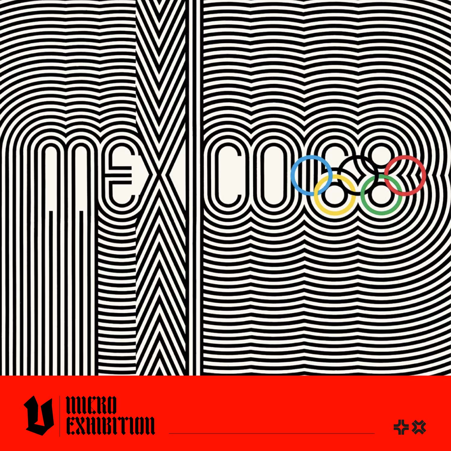
Why is the Mexico 1968 Olympic Logo so Captivating?
This logo and branding were inspired by the patterns of the Huichol, an Indigenous people of Mexico, optical art, and geometric design. The artwork was designed by Pedro Ramirez Vazquez, architect and President of the Organising Committee for the Games, Eduardo Terrazas (MEX), and Lance Wyman (USA).

How is the Los Angeles 1984 Olympic Logo Inspired by the US Flag?
Robert Miles Runyan designed this emblem. The star motif conveys mankind's highest aspirations and a sense of physical movement. The red, white, and blue colourway is intended to represent the three medal positions and the host nation's flag. The 13 horizontal lines that comprise the stars also reference the 13 stripes on the American flag.

What Popular Olympics Design Element had its Debut at the Munich 1972 Olympics?
The design concept for the games was titled, 'Radiant Munich'. The Alps inspired the bright, vibrant colour scheme and deliberately avoided the black, red and gold colours of the Berlin '36 Olympics. The emblem was designed by Otto "Otl" Aicher, head designer for the Munich '72 games, and reworked by Coordt von Mannstein. This was the first Olympics with an official mascot design; Aicher created a dachshund called Waldi, who embodied the ideal attributes for Olympians: resistance, tenacity and agility.

Celebrating the Deceptively Simple Design of the Tokyo 1964 Olympic Logo
This striking design depicts the Olympic rings beside the emblem of the rising sun, representing the Japanese national flag. Designer Yusaku Kamekura's use of gold and white to create the interlaced Olympic rings perfectly highlights this carefully balanced design.

How the Beijing 2008 Olympic Logo Combines Contemporary Needs with Ancient Techniques
This emblem, called 'Chinese Seal-Dancing Beijing,' combines the design of a Chinese seal, the art of calligraphy, and sporting features. It represents a human figure running triumphantly forward and uses red, the colour of the Chinese flag.

We hope you have enjoyed our article on the logos of the Olympic games. Which designs would you include in your top five?