How Japanese Woodblock Artists Used Muted Colour in Their Work
Japanese woodblock printing developed as both a practical and artistic method from the seventeenth century onwards, and artists such as Hokusai and Hiroshige used the medium to depict landscapes, weather and daily life with clarity and precision. Colour in woodblock printing was created through separate carved blocks, each inked with a single pigment. Because inks were water-based and applied in thin layers, they produced softer transitions and naturally restrained palettes. The paper’s tone also played a visible role, often serving as sky, snow or water. Muted colour became a defining feature of the medium, shaping structure, light and depth across these prints. Today, we’re looking at five ways woodblock artists used muted colour in their work. Let’s go!

Hiroshige
1. How Colour Conveys Light
Woodblock artists often relied on softened, low-saturation palettes to capture moments when light feels gentle, at dawn, at dusk or when snow begins to fall. These scenes don’t need strong highlights; instead, they depend on slight tonal shifts that let the light settle across the image and build atmosphere.
A key part of achieving this effect was bokashi, the controlled colour gradient made by wiping or brushing ink so it fades gradually across the block. Bokashi allowed printmakers to imitate the way light behaves in nature, soft with drifting borders.
Kawase Hasui’s Zojoji Temple in Snow is the example we’ve chosen. In this piece, the sky moves from deep blue at the top to a paler, cooler tone near the horizon, capturing the clarity of cold winter light thickened by falling snow. Against this muted backdrop, the flakes seem to drift through real space, and the temple’s red architecture glows without overwhelming the scene. The restrained blues, greys and whites give the print a soft, luminous calm.

Zojoji Temple in Snow by Kawase Hasui
2. Using Muted Colour to Suggest Depth
Japanese woodblock artists often suggested distance through colour that gradually thins as it recedes into the landscape. Muted tones, softened edges and gentle shifts in value allowed mountains, water and far-off buildings to blend into the atmosphere while the foreground remained crisp and full of colour.
We’ve already talked about bokashi as a way of shaping light, but it also played a major role in creating depth. Printers used damp cloths and soft brushes to ease pigment across the block, creating horizons that lighten in the distance and mist that settles between layers of hills. This soft recession of tone is one of the most effective ways for woodblock artists to convey space.
Depth was also built through layering: overlapping blocks in subtle blues, greys and greens created a sense of space without relying on heavy contrast. The introduction of Prussian blue in the late eighteenth century gave artists a deeper foreground tone, while paler washes of the same hue allowed distant forms to gently fade.
Hokusai’s Storm Below Mount Fuji offers an example of this colour logic at work. The sky, a deep Prussian blue, fades into a soft, creamy light near the horizon, creating a spacious backdrop for the red flank of Mount Fuji. With only a few carefully controlled tones, the print moves from crisp foreground to airy distance, showing how muted colour alone can create a convincing sense of depth.

Storm Below Mount Fuji by Hokusai
3. How Selective Colour Can Be A Focal Point
When the palette of a woodblock print is muted, even a small increase in colour strength can become the focal point. Artists used this intentionally, introducing a single vivid note to guide the viewer’s eye toward a figure, an object or a piece of architecture.
You can see this in Hiroshige’s Sudden Shower over Shin-Ōhashi and Atake. Almost the entire print is built from subdued blues, greys and soft browns, capturing the heavy atmosphere of a sudden downpour. Against this restrained backdrop, two figures in red garments stand out immediately. The colour is not especially bright on its own, but within this muted palette it becomes a point of energy and focus. That slight lift in saturation anchors the scene, drawing attention to the human scale within the weather and the large wooden bridge. By maintaining a subdued palette, Hiroshige lets a single, purposeful colour lift shape the way the image unfolds before us.

Sudden Shower over Shin-Ōhashi and Atake by Hiroshige
4. Using Muted Colour to Organise Complex Scenes
Landscapes, bridges and busy city views often involve many overlapping forms, and woodblock artists relied on muted colour to keep these compositions clear. Softer tones help separate planes, guide the eye and prevent densely layered scenes from becoming visually confusing. When the background is subdued, the architecture and pathways remain readable without overwhelming the viewer.
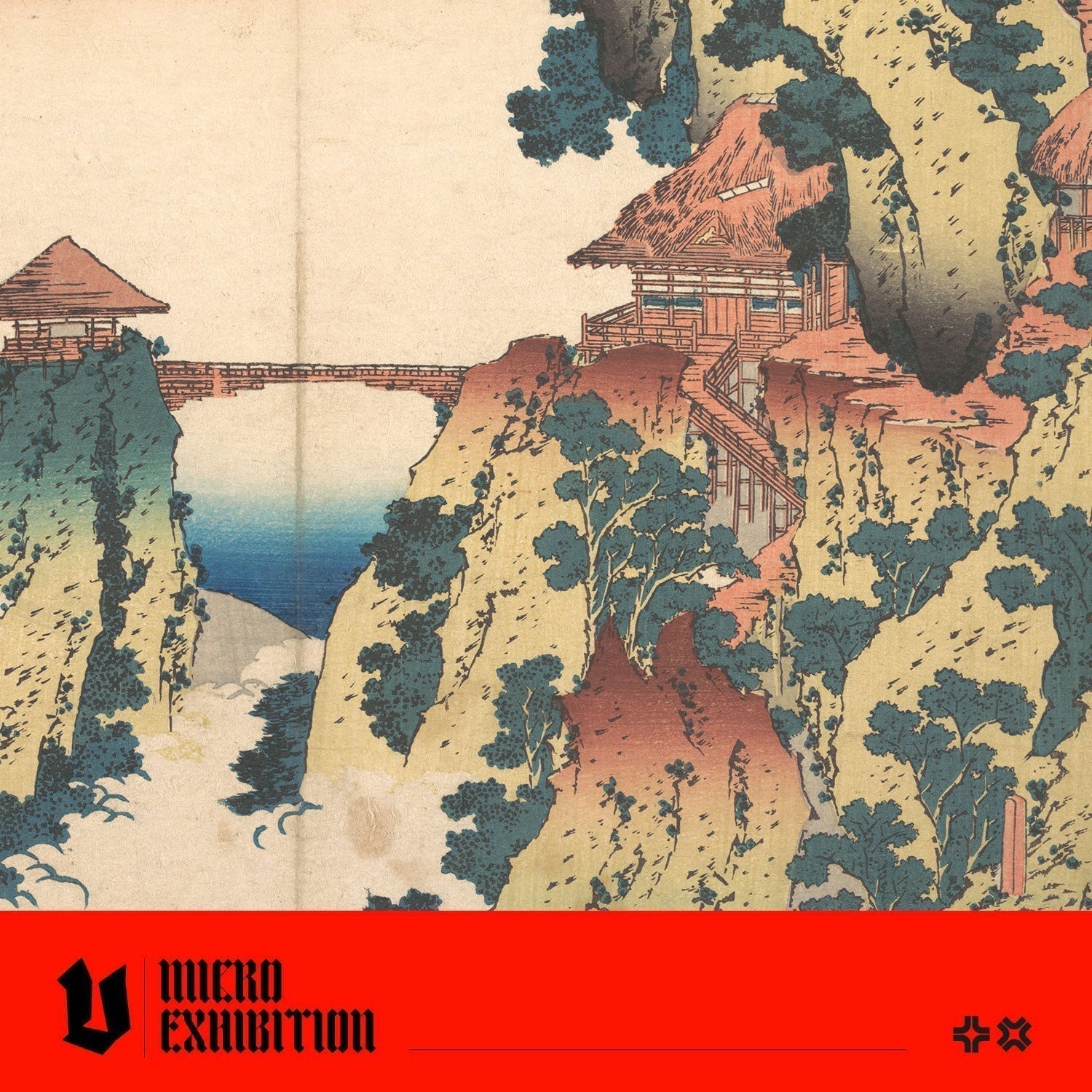
Hokusai’s The Hanging-cloud Bridge at Mount Gyōdō, from his series Remarkable Views of Bridges in Various Provinces, is a strong example. The cliffs, trees and drifting clouds are arranged in intricate layers, yet the palette is deliberately softened: pale yellows, cool blues and gentle red-browns create distinct zones without competing for attention. The muted tones hold the scene together, allowing the bridge and buildings to remain the focus while the surrounding shapes recede just enough to create depth. In a composition this complex, restraint in colour is what makes the landscape feel harmonious.

The Hanging-cloud Bridge at Mount Gyōdō by Hokusai
5. Integrating Paper Tone Into the Image
Woodblock artists often allowed the natural tone of the paper to become an active part of the composition. When the surrounding colours were kept muted, the unprinted areas could stand in for sky, mist, water or open air, giving the scene a sense of lightness without the need for additional colour blocks. This approach reduced complexity while creating a balanced, spacious structure.
Kajikazawa in Kai Province by Katsushika Hokusa shows this beautifully. Much of the sky and distant water is simply the warm paper tone, lightly shaped by blue gradation at the edges. Because the palette is so restrained, soft blues, pale greys and a few deeper tones in the waves the untouched paper reads naturally as atmosphere. It creates a quiet expansiveness around the fishermen, allowing the movement of the sea and the sweeping lines of the ropes to stand out. The print feels open and airy because so much is left unprinted.

Kajikazawa in Kai Province by Katsushika Hokusa
Feeling Inspired? Try A Creative Prompt
Two-Tone Study
Choose an image from your archive and reinterpret it using only two tonal values. Work with one light tone and one dark tone to define form, shadow and structure. This helps you understand how woodblock artists relied on contrast rather than colour to organise a scene.
Simplifying a Busy Scene
Take a composition with many elements and reorganise it by reducing the saturation of everything behind the focal point. This mirrors how woodblock printers used restrained palettes to keep complex views readable.