The Evolution and Origins of Blackletter Typeface: From Medieval Mastery to Modern Adaptations
Join us on a journey through the history of Blackletter typography. We'll examine some examples of Blackletter text and explore their origins and uses, both historical and contemporary. Let's go! 
Bible (King James)/Numbers#1:24. Vulgate manuscript: Book of Numbers 1:24-26 (edited for clarity)
The Origins of Blackletter Typefaces
Blackletter typefaces originated in Western Europe during the Middle Ages, around the 12th century. Blackletter (also known as Gothic script or Textura) developed from Carolingian Minuscule, the lettering style prevalent at the time. Blackletter text was quicker to write than Carolingian Minuscule. This was important because books were in high demand due to an increasingly literate population and the need to stock newly founded universities with books on scholarly topics. This type style swiftly gained popularity, becoming dominant in Germany, the Nordics and other parts of Europe.
The Diverse Styles of Blackletter
Blackletter encompasses a variety of styles, each with unique characteristics and historical significance. Let's delve into some of the most notable ones:
Textura
Textura is distinguished by its tall, angular letters and is the most calligraphic of the Blackletter styles. The name 'Textura' references the textural quality of the script; its angular features make the page resemble patterns on a piece of fabric. This style was primarily used for literary and scholarly texts. The Gutenberg Bible, Europe's earliest significant books printed using mass-produced movable metal type, is an iconic example of Textura Blackletter. 
First page of the first volume: the epistle of St Jerome to Paulinus from the University of Texas copy. The page has 40 lines. (edited for clarity)
Cursiva
Cursiva developed in the 14th century as a simpler version of Textura. Paper had replaced parchment as a writing substrate, and its smooth texture made it quicker and easier to write in cursive. This style doesn't have a defined form, and design features can vary. Gerard Isaäc Lieftinck, an academic specialising in Medeval European manuscripts, has categorised Cursiva into three groups: littera cursiva formata, a legible and calligraphic style. Littera cursiva textualis (or libraria), the typical format, is written using a large pen and used for writing standard books. Littera cursiva current was used for textbooks and unimportant books, with very little form standardisation.
Schwabacher
Schwabacher was the most common typeface in Germany until Fraktur replaced it in the mid-16th century.
The Schwabacher script derives from Textura and is recognised for its distinctive and pronounced round shapes, giving it a 'handwritten' look. It was the most common typeface in Germany from the late 15th century until Fraktur replaced it as the most popular style in the mid-16th century, though it was still used to emphasise text.

A page from the Nuremberg Chronicle (Schedelsche Weltchronik), 1493
(edited for clarity)
Fraktur
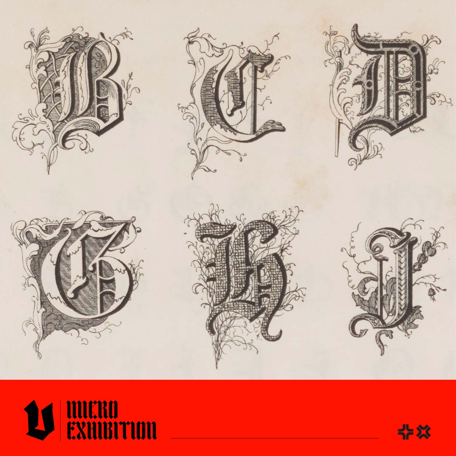
Arguably, the most famous of the Blackletter styles, Fraktur, emerged in the early 16th century. Fraktur is characterised by its sharp, broken lines (hence the name 'Fraktur', meaning 'fracture' in Latin) and its complex, ornate capitals. Fraktur was often characterised as "the German typeface" because it remained popular in Germany, Norway and Eastern Europe while other European countries used the Antiqua style. In Germany, the use of Fraktur typefaces was ended by a government order in 1941. Its popularity remains today, and it is mainly used as a decorative typeface.

Front page of Gustav Vasa's Bible from 1541, printed using Fraktur
(edited for clarity)
The Lasting Impact of Blackletter and Modern Usage
Blackletter type continues to influence modern typography, appearing in various forms of media, branding, and art. The resurgence of Blackletter in contemporary design reflects an appreciation for its intricate beauty and a recognition of its place in the history of printing. In the modern era, Blackletter has found a new audience as it provides a striking contrast to the simplicity of contemporary sans-serif styles. Designers often use Blackletter to evoke a sense of tradition, elegance, or impact.
The continued popularity of Blackletter text is a testament to the enduring power of typography to convey not just words but a rich tapestry of history and culture. From its medieval origins to its modern adaptations, Blackletter remains a fascinating and influential force in the world of typography, captivating designers and history enthusiasts alike. Gutenberg Bible of the New York Public Library; purchased by James Lenox in 1847, it was the first Gutenberg Bible to be acquired by a United States citizen.


